

A Colorful Equilibrium for your Interior with Pantone Spring Colors

With the Pantone Color Institute you need never worry about knowing what colors are right from season to season!
Based on research, insight from leading designers and industry experts, you can uncover the best on-trend colors for Spring 2014! Once you see them, you’ll find they aren’t just for the Spring season, but can add a dash of color to any room, to enjoy all year long. And whether you use them alone, or in combination they’ll create a colorful equilibrium for any space.
Placid Blue
Placid Blue probably makes you think of baby boys, sunny blue skies or the nautical décor of a beachside bungalow.
Whether it is your cabinets, your curtains, or your walls, this color is sure to add a cheerful hue to any room.

Photos Credit: Google
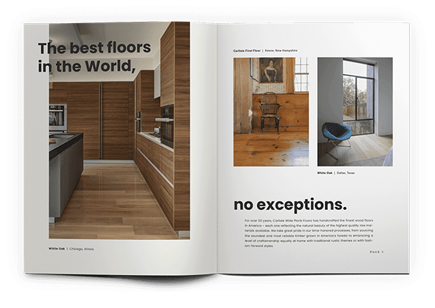
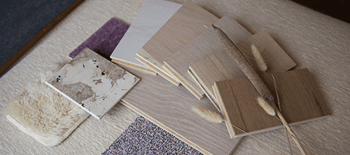
Endless Inspiration for the Floor of Your Dreams
GET DESIGN BOOKViolet Tulip
Violet is a soft, pastel color that can bring a feminine spirit to any space.
It makes a nice contrast to emerald and sage greens – especially endearing to those of you with a green thumb. Or complement it with bright, white cabinetry, and furniture for a clean, crisp look. Use varying shades of the Violet hue on the furniture, walls and lighting for a more dramatic impact.

Photo Credits: Google
Hemlock
Visions of 70’s era sofa and refrigerators might come to mind when you check out the Pantone Hemlock hue.
But, we think it’s time to let go of old stereotypes for this pleasant pastel, so you can see it in a modern light.
Retro appliances, like those from SMEG, are back in style. But this color doesn’t mean you have to create a vintage look.
Look for modern lighting pieces or bedding, for a spring-inspired décor. Or why not switch up your wall color or the upholstery on your favorite couch.
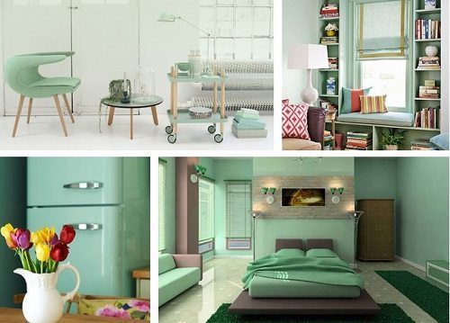
Photo Credits: Google
Paloma
Spring, summer, winter or fall, gray just never goes out of style for fashion or home décor – and it is not hard to see why.
You can go nautical use Paloma on your exterior, to recreate the appearance of weathered gray shingle siding of your favorite beachfront home. Or dress things up with a sophisticated look using gray and white color palette in your new master bedroom. Create a vintage look with rattan or wicker furniture and accents and some distressed oak wood floors. Freestanding tubs are all the buzz in 2014, as is metallic so why not pick up a silver clawfoot tub for your bath.

Photo credits: Google
Sand
Natural colors, like Pantone Sand, seem to never go out of style.
You can use them in the most elegant, or the most casual setting, depending on the other interior décor elements of the home. And when your décor starts with this color as the foundation, in your walls or your sofa, you can mix them with bright orange, subtle gray, and everything in between.
You can find a variety of interior décor items in this shade from Wide Plank White Oak hardwood flooring in Peaceful Sand, to lighting fixtures, and window fashions.
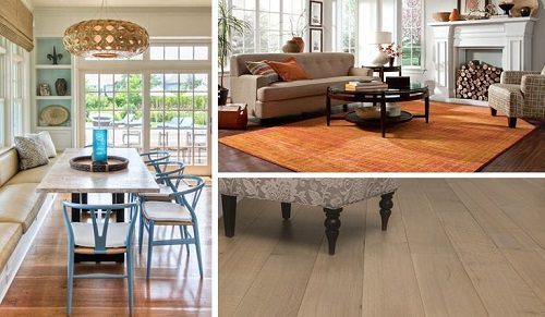
Photo Credit: Google
Decorating with this color makes it easy to stay on trend, and adjust your décor from season to season as you see fit!
Freesia
If you want to go bold this Spring, then the Pantone Freesia color is for you!
No matter what the day says outside – rain or shine – you are sure to brighten up your space with the vivid rays of sunshine. You’d be surprised what Freesia can go with, everything from simple white cabinetry (which goes with anything) to a zebra print rug.
If you really love this color repaint an entire room, or go more subtle with a freesia design on your wallpaper. Create a 2-tone effect and repaint your dining room chairs, or pick a favorite piece of new furniture to brighten up your room.
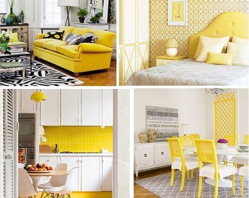
Photo Credit: Google
Cayenne
The color red exudes a lot power, demands attention and stimulates the mind.
Red is also versatile. Infuse your space with oriental, Spanish or Indian textiles – all of which are sure to come in vibrant Cayenne red. Mix it with other pantone colors like some Paloma and Sand and create a southwest feel. Or add in some white and black for a luxurious look, with the ultimate contrast. Or why not start your home décor out right, and give everyone a warm welcome, with a Cayenne front door!
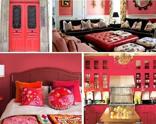
Image Credit: Google
Celosia Orange
Like red, orange commands attention. Like the yellow of Freesia, it is often shied away from for its overbearing nature.
But if you love Sunkist and orange sherbet Pantone’s Celosia Orange might be right for you. Highlight an island in your kitchen with orange beadboard. It goes great next to dark wood floors! There are some great furniture pieces with which you can adorn your home too. Or go all out with rugs, walls, curtains and textiles.
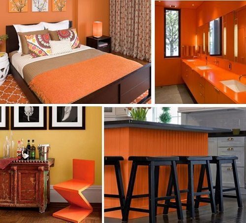
Photo Credit: Google
Dazzling Blue
There is a reason they call it “dazzling blue”. When you walk into a room with this color you’ll be thinking of radiant blue gemstones.
But don’t be fooled. Blue is a calming color, and create a relaxing backdrop for your space. Like its lighter cousin, Placid Blue, it always goes with white. But mix it with grays and blacks for something more chic and modern. The good news is, you can mix it with a variety of other colors and metals, like gold and bronze, both popular in 2014.

Photo Credit: Google