The 2019 Color Trends That Will Transform Your Space
Every year, designers are bombarded with predictions about which color palettes will dominate the future of design. From millennial pink to deep oxblood, tones change annually. These decisions may seem arbitrary, but months of careful planning, deep thought, and data analysis go into each selection.
Are you curious about what the future holds? Join us as we explore the meticulous research that goes into choosing the colors of 2019 and how to select the best palette for your home.
Who gets to decide the color of the year?
Color can make or break the overall feel of a space. Choosing the right shade can take a room from uninspired to unbelievable, even before you’ve chosen the furnishings. The right tone plays an integral role in setting the mood of the room and making it something special. However, who gets to determine these trends?
For this, we turn to the heavy-hitters of color predictions: the Pantone Color Institute, The Color Marketing Group, Akzo Nobel Global Aesthetic Center (Dulux), and of course the authority on all things paint related – Sherwin Williams.
All of these organizations employ teams to analyze and forecast trends in color-related products and services. They take stock of everything from the current political climate, the economy, cultural diversity, technology, fashion, social issues and the state of the environment to determine which colors and themes are likely to embody the near future of color marketing. Having a keen understanding of the circumstances that affect shifts in color direction is as important as choosing the color or overall palette of the year.
It takes months of research and years of experience to make these decisions and in the end – is anything but random. This year’s colors were chosen to reflect the current state of global affairs, and hope to embody the direction design will go in the future.
What we can expect for 2019
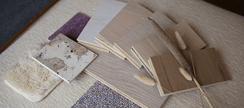
According to the Sherwin-Williams 2019 report, designers can expect to be awash in bold color choices this season, as collections gradually move away from the minimalistic neutrals we embraced over the past year. Gathering 42 trends into master palette personalities, they capture the earthy, sun-washed tones of nature along with a vibrant, enthusiastic pop of warm pink and orange hues. Here are our favorites, and the flooring they pair best with –
Shapeshifter Palette

![]() This motif seeks to bring out the futuristic thinker in all of us. Visionary and creative, this palette reaches into the cosmos with hints of bold colors on a saturated blue background. With pops of mustard, sea blue, and moody gray it stirs up visions of technology and spirituality combined. Paired best with these Carlisle floors:
This motif seeks to bring out the futuristic thinker in all of us. Visionary and creative, this palette reaches into the cosmos with hints of bold colors on a saturated blue background. With pops of mustard, sea blue, and moody gray it stirs up visions of technology and spirituality combined. Paired best with these Carlisle floors:
 |
 |
 |
Wanderer Palette

![]()
With this collection comes visions of the American Southwest. The red of desert canyons, the buttery hue of worn leather and dusty blue of the Arizona sky aim to bring a taste of the outdoors inside. Perfect for anyone seeking a warm, Zen escape with a hint of mystery and love for exploration. Paired best with these Carlisle floors:
 |
 |
Aficionado Palette

![]()
Those drawn to this theme have a love for the bespoke. They enjoy the classics, tradition and the appreciation that comes with well-worn familiarity. One of the few grouping that includes metallic, like gold and copper, along with deep merlot, stormy gray and comforting cappuccino. Paired best with these Carlisle floors:
 |
 |
 |
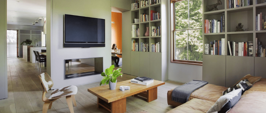
Naturalist Palette

![]()
Looking to the garden for inspiration, this palette unites the vivid greens and delicate floral tones found in a country estate. Perfect for the budding botanist, plant mama, and lush, sophisticated gardener, this grouping spans everything from earthy Portobello to hibiscus pink. Paired best with these Carlisle floors:
 |
 |
 |
With these themes, color marketers hope to entice designers into identifying with both a color palette and a way of life. They’re asking, if these colors were people, what would they like? Who would be they be? How would they enjoy spending their time? However, Sherwin Williams isn’t the only one betting on bold.
According to Pantone, the vibrant, saturated color will be the go-to in 2019, much like UltraViolet was for 2018. With their new collections they’re betting on our love for the indulgent to get us hooked.