
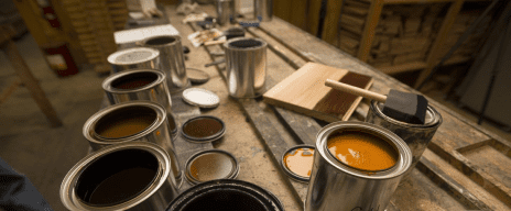
Contact us to speak with a Carlisle Wide Plank Specialist about your project and the look you are trying to achieve. We can provide you with flooring and color recommendations to help you create the perfect look. Get custom color samples to help you with your final selections.
How to Mix Patterns From Walls to Hardwood Floors
Tagged as: bold patterns | design inspiration | home decor | interior design | playing with patterns | unique rugs
You don’t need to be an interior design professional to know that mixing patterns, from prints in your drapes, furniture to the texture on your walls or one of the many exciting parquet floor designs available, can seem as intimidating as skiing down a double black diamond. It feels like one wrong choice could lead to aesthetic disaster. But, keep in mind that when patterns are executed thoughtfully, the harmonious contrast, color and visual interest they create is something truly spectacular.
Ensure a favorable outcome for your next design challenge by following a few mindful instructions for mixing patterns in your home. Join us as we lead you through common questions, untangle the mystery surrounding scale, shape and color, and show you which rules can almost always be broken. With our careful guidance, you’ll be a pattern pro in no time.
One Color Reigns Supreme
As with all great designs, it is important to first establish your color baseline or dominant hue. Decide which general direction you plan to follow and build outwards from that point. Do you have a theme in mind? Does this theme fit the style of your home? Before you get too carried away dreaming of beachy prints or French florals, choose a color that will form the foundation of your vision.
By deciding now on a single color that will act as the starting point, you set the anchor for the room. All other design choices will take this shade into consideration. This first step will assist in keeping the overall look and feel of your room cohesive, even as you start to add layer upon layer of colors and patterns along with contrasting hardwood floors.
Once you have established your neutral, it’s time for the next big question: What does your primary pattern look like and how much of a focal point do you want it to be? In modern design, the general rule is to dedicate no more than 30% of the space to patterns, but if you’re feeling confident, we heartily encourage you to break this standard. Design is about having fun, and if a bold pattern on pattern space speaks to you, own your creativity and go for it!
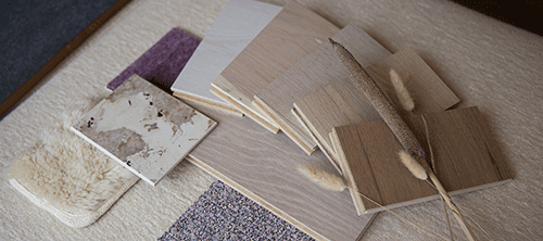
Endless Inspiration for the Floor of Your Dreams
GET DESIGN BOOKPicking Patterns and Prints
Now that you’ve decided the quantity of print you would like to include, pick your pattern. If you have a single pattern in mind that will work well with your solid neutral, use it as inspiration for all your secondary prints. Keep in mind that we’re always considering balance. Even when adding patterns to patterns, visual harmony is key to creating a purposeful look.
Always consider the role each additional pattern will play in the space.
- Does it add a contrasting color?
- Will it pull the room together?
- Do I love this item more than anything and want to use it as inspiration and have it act as my primary pattern?
There are many different features in a room that we love to highlight with prints. From walls and floors to chairs and sofas, your print palette can be splashed across almost anything.
It’s easy to play it safe with neutral and pastel colors in your interiors, however, don’t shy away from bold colors and prints. This interesting article in mymove.com gives some excellent easy design ideas to mix and match patterns and prints in your home that will give you that wow factor without it feeling too busy or overwhelming.
Anchors Away
Now that your anchor point is secure, it’s time to experiment with accents. Pulling patterns together is more than just choosing prints in similar shades. You can rely on a host of different techniques to make your selection match as well as draw the eye.
When mixing patterns, one method is to select simplified versions of your primary fabric. If you love florals, make your primary fabric one that combines several different types of flowers, then use secondary patterns with only one or two similar blooms. If you lean towards the abstract, pull a sample of color out from your main pattern and break it down across a few different designs.
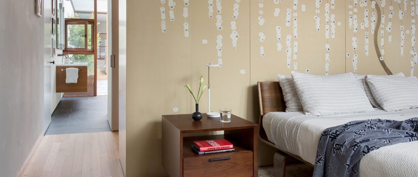
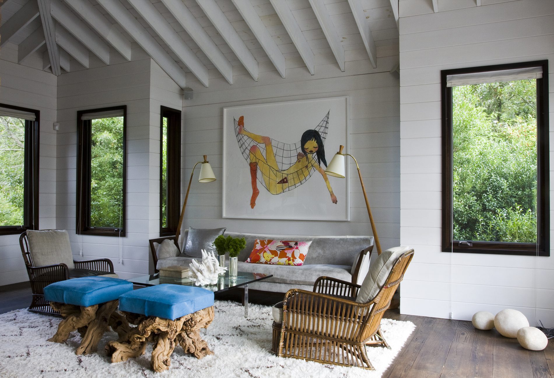
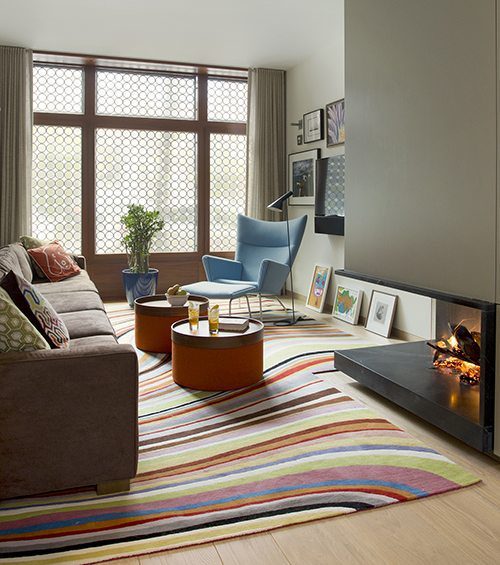
As you can see in the photo above, the hickory hardwood flooring with a hand-scraped texture and medium-brown stain is the perfect balance to anchor the mix of prints, textures and colors in this living room. This helps the space to feel comfortable and welcoming to both your mind and spirit.
Color Theory Meets Contrast
This is a great place to test out your skills in color theory. For shades that make a statement, choose complementary hues from your main pattern and work outwards. The high contrast of complementary colors creates a vibrant look — especially when used at full saturation. Think sky blues and burnt orange, or steel gray and sunny yellow.
For a look that’s a bit more subtle, turn to analogous colors. Analogous color schemes use colors that are next to each other on the color wheel. They match well and create serene and comfortable designs. Analogous color schemes are often found in nature and are harmonious and pleasing to the eye. Think Mediterranean blues, sea-salt white and kelp-inspired green. They’re perfect for adding a hint of Zen to an otherwise busy room.
The only thing we suggest is to make sure you have enough contrast when choosing an analogous color scheme. Choose one color to dominate, a second to support, and a third to accent — along with your neutral background hue.
All Hail Scale
 With your color scheme, main pattern and ideas for secondary patterns in-hand, it’s time to consider scale or the size of one pattern in relationship to another. We suggest choosing a selection of small and medium prints, only focusing on one large print as an accent to your primary pattern.
Also, be sure to test out how your patterns look together. You may love a print solo, but when it’s paired up with potential partners, the impact it makes on your space will change. This is also true when choosing prints for large items or walls.
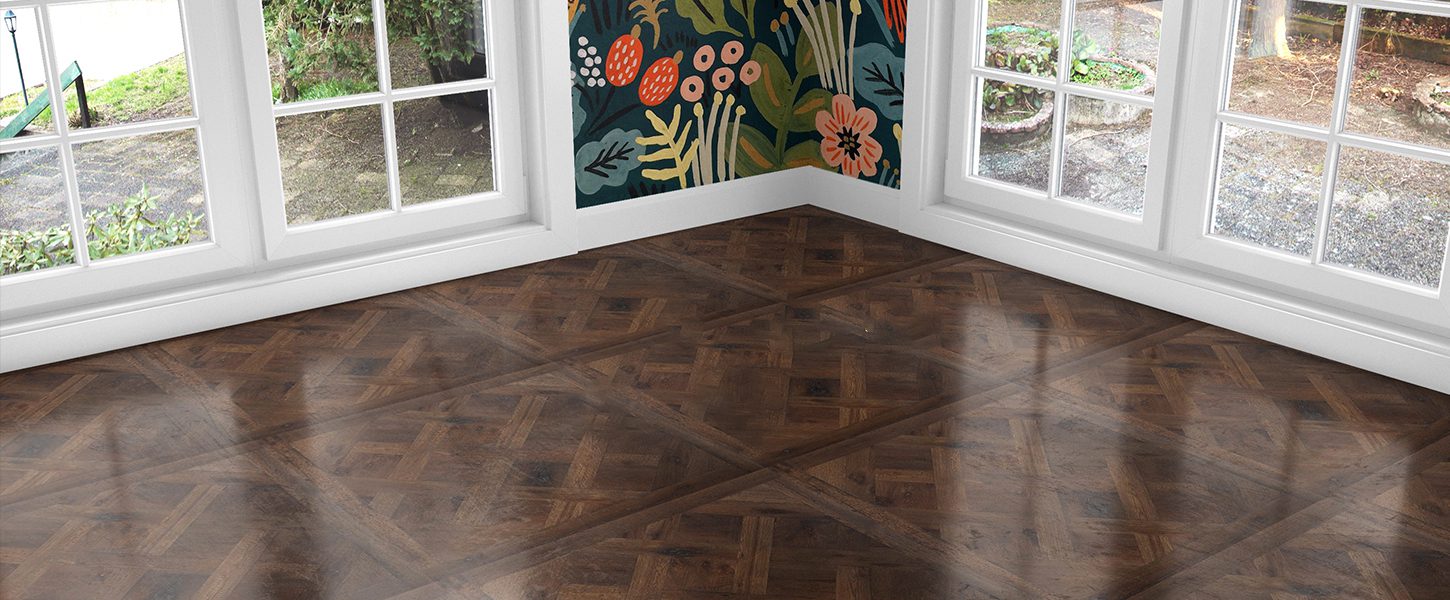
This revamped Carriage House in Boston’s Historic District is a small space and most of us would never consider adding such a large bold colorful rug to a room this size. But once you add a light colored hardwood floor, neutral walls, and natural light it works and invigorates the space without overpowering it.
Going the Distance
Before confirming your choice, observe it from different distances. A tiny print on a large item will appear more like a neutral when viewed from across the room, while a loud pattern on a tiny chair may seem visually quiet.
We love the idea of pairing bold patterned furniture with neutral carpet or adding graphic wallpaper behind a solid-colored dining table. By doing one or the other, or carefully executing both, you tie together all the elements of the space.
One trick designers use is to choose an odd number of patterns. This selection ratio knocks things just far enough out of symmetry to keep things interesting while still providing visual balance.
– – – – – –
When it comes to patterns, use these tools to bring your home into visual harmony. And don’t be afraid to experiment. Contrasting patterns work on everything in your home. From walls to wood flooring, upholstery and tile, there is no place these principles can’t be utilized. Test the waters or jump right in. Pattern possibilities are as limitless as your imagination.
Read the stories and learn more about the projects in this article:
Ucci Residence, Shanty Bay Ontario
Talk to a specialist about your project
Get custom color samples within 7-10 days.